My Text

It is the wisdom of man to sacrifice for his fellow man, in a wise manner

Sunday, March 20, 2022

Where could one publish/post a supplementary video for a published paper?

 It is good practice to share video data or dataset of your research. It could be as a supplementary video or a published peer reviewed video. Some tend to use video hosting sites like Vimeo and Youtube, but the academic community requires Digital Object Identifiers (DOI).

Hence, my submission brought about this question: Where could one publish/post a supplementary video for a published paper?
It should be fine to publish a video, and add the DOI. I believe it is a good idea to publish it.
Videos are among the file types accepted by Figshare, which is an online digital repository operated by Macmillan Publishers. You can create an account for free, and you will get a DOI when uploading files which you can then cite in your paper.
Also have a look at Zenodo, a research data (including movies) and text repository operated by CERN and OpenAIRE. Zenodo will also generate a DOI for your publication, just like Figshare. However, unlike Figshare, Zenodo is not owned by a big corporation.
In general, your video does not necessarily have to be peer reviewed as a supplementary file. But it may have to be published after peer review by a journal, if submitted alongside for a journal paper.
Otherwise, the best place is the one of these repositories or a personal/institutional web page, and give a link to your publication in a video frame itself.
However, I do suggest that you may check out your university's repository. For instance, am in Lancaster University UK, where we use PURE Lancaster, and it accepts submission of datasets, which I assume should also generate DOI - I might be wrong but you can ask the team of your institution, like mine is via library@lancaster.ac.uk or pure@lancaster.ac.uk.
Else, you can use it as a secondary repository as usual, not the primary submission host site for the video.
There are many ones like arXiV to use that will not do peer review of the video publication but your choice is fine. arXiv is an open-access repository of electronic preprints and postprints approved for posting after moderation, but not peer review. It is owned by Cornell University.
You can also use ResearchGate to upload it and generate the DOI.
My advice is to use a repository that will generate DOI for you.
If Mendeley repository will generate DOI, then use it.
The main decision of knowing if it will be peer-reviewed or not should not matter, it is your video.
See the following:
  1. FIGSHARE https://help.figshare.com/article/how-to-upload-and-publish-your-data
  2. ZENODO https://zenodo.org/
  3. arXiv https://arxiv.org/
  4. ResearchGate https://explore.researchgate.net/display/support/ResearchGate+DOIs
  5. Pure Lancaster https://pure.lancs.ac.uk/workspace.xhtml
  6. Mendeley Repository https://data.mendeley.com/
Hope this helps! However, I would like to have more answers and thoughts.

How do you prepare your Conference Poster?

 One challenge that is seen in conference poster sessions is the best design for their work, or research or company profile. This is seen by both industry partners and academics- professors, researchers and students. As part of the research activities, PGRs and Faculty staff may be requested to submit a research poster to be displayed on the poster day and entered into the poster competition. It is a great opportunity to present your work and talk about it with other researchers in an informal atmosphere.


So, issues that are raised include:
1. How should I design it?
2. What is the poster orientation -portrait or landscape?
3. What print material should be considered for the poster- gloss or not?
4. What is the poster size to use- AO or not?
5. What colour should the background theme be on?
6. What is the tool to use- MS Powerpoint or if a template or an online template or poster creator?
7. How do you format your poster? Do you justify them to one side or centralise them?
8. What colour is the font and what font sizes should be used in the title and body of each sub-section?

Hence, I profer the following notes:
1. POSTER is only one slide not 6-7 slides, if you are using MS Pointpoint.
2. Show more information with bullet points and more images. Use less wordy or crowdy content.
3. If you think that the space is too small to contain all the information, I will suggest that you remove some of them. The less words you have but clearly, brighter and more legible work is best.
4. Simply use one of MS Powerpoint template (I can send one to you)... from any of the ppt I also published on my profile as Conference posters.
5. If you use a template, you can easily edit and place ur things into it... It should have good space management to modify or customise as you want.
6. It has best if it has been proofread, you may make some spelling mistakes or misplace some contents. Please, always proofread your work.


Have you ever seen a really great presenter and wondered how they do what they do? Giving a great presentation is largely about practice, but there are many things that you can learn to do that will improve your stage presence and the way that you connect with a conference audience. You may attend conference sessions and training that will focus on your needs and explore tricks, tips and techniques of great presenters – and at times the context will be research presentations.

Although the themes of such sessions will come from your needs, requests and questions, by the end of the training you should be able to: prepare a good conference poster, deliver a message the audience will respond to, and guide an audience through dense and difficult material. You should also build a rapport with an audience, handle questions with confidence, show a confident stage presence, project your voice more effectively and deal with nervousness and use audio visuals effectively and so avoid PowerPointlessness.

If you want to use Conference Poster Templates, you can prep everyone for your conference with a poster that showcases your theme with fun and finesse using out-of-the-box templates you can customize for free. Here are some links for free Conference Poster Templates:
1. DesignCap https://www.designcap.com/poster/conference.html
2. Canva https://www.canva.com/posters/templates/conference/
3. Postermywall https://www.postermywall.com/index.php/s/conference-poster/all
4. MindtheGraph https://mindthegraph.com/app/poster-maker
5. MakeSigns https://www.makesigns.com/SciPosters_Templates.aspx
6. Craft of Scienctific Posters https://www.craftofscientificposters.com/
7. PiktoChart https://piktochart.com/templates/posters/conference/
8. PosterPresentations https://www.posterpresentations.com/free-poster-templates.html
9. ColinPurrington Poster Design Templates https://colinpurrington.com/tips/poster-design/


According to ColinPurrington, here are some DOs and DON’Ts (see https://colinpurrington.com/tips/poster-design/), below are some tips to avoid producing a terrible poster.
  1. The number one mistake is to make a poster too wordy. Aim for 1000 words or less. That might mean 700 words in paragraph form (body text), plus 300 words in the legends of all your figures and tables. Below is an example poster that has almost 2000 words, 1000 too many.
  2. The second-most common mistake is related to the first: a failure to maintain a pleasing amount of white space around text boxes and figures. A cramped poster is hard to read, and the brain simply cannot effectively process the information provided, regardless of how amazing it is.
  3. Avoid titles with colons if you can: they are overused. If you absolutely must have a coloned title, just be sure it doesn’t force you to spill onto a third line.
  4. Format the title in sentence case (#1, below) so that capitalization and italicization are preserved in trade names, Latin binomials, gene names, allele names, etc. For example, title case (#2 below) and all caps (#3 below) obscure such information. Effect of ken and barbie knockouts on sexual preference in Drosophila melanogaster Effect of Ken and Barbie Knockouts on Sexual Preference in Drosophila Melanogaster EFFECT OF KEN AND BARBIE KNOCKOUTS ON SEXUAL PREFERENCE IN DROSOPHILA MELANOGASTER.
  5. Use a non-serif font (e.g., Helvetica) for title and headings and a serif font (e.g., Palatino) for body text. Serif-style fonts are much easier to read at smaller font sizes (that’s why novels are rarely set with Helvetica and the like).
  6. Do not add bullets to section headings. The use of a bolded, larger font is sufficient for demarcating sections.
  7. The width of text boxes should be approximately 45-65 characters. Lines that are shorter or longer are harder to read quickly.
  8. Don’t vary the width of text boxes (it’s visually distracting).
  9. Whenever possible, use lists of sentences rather than blocks of text.
  10. Use italics instead of underlining. Underlining draws too much attention to a word.
  11. When using acronyms and numbers (e.g., ATP, 42) within the body of text, scale down the font size by a couple of points so that their sizes don’t overpower the lowercase text. Use of “small caps” will sometimes do the trick, but this effect varies with different fonts and with different software.
  12. Set line spacing manually to make sure spacing is uniform. Doing this is critical if you have used super- or sub-scripted text. If you don’t, only some lines will have extra space, and that would be visually distracting.
  13. Do not trust the tab button to insert the correct amount of space when you are indenting a paragraph (the default is usually too big). Set the tab amount manually, with the ruler feature. And never, ever use spaces to create a tab-like space (it just doesn’t work).
  14. When you have quotations, make sure your software hasn’t used the “double prime” glyph instead of quotation marks. Double primes are the thingies used for inches (e.g., 5′ 11″), and mathematical formulas/formulae.
  15. Correct any errors in spacing wit hin and between words, especially before and after italicized     text. (See how annoying that is?!)
  16. Use only a single space between sentences. The double-space convention was needed for typewriters so insisting on two spaces marks you as old person. Use the Search/Replace feature to globally replace all double spaces with single spaces (and to locate locations where too many spaces occur between words).
  17. Avoid dark backgrounds for text boxes. Dark text on white is the easiest for most people to read. Also, dark backgrounds make designing graphics much harder. It’s better to just use a white background. And you save on ink, too.
  18. Avoid color combinations that create problems for those with color-deficient alleles. Approximately 8% of males and 0.5% of females have some degree of color-vision deficiency (example). To test whether you’ve made a terrible mistake in color choice, you can run a JPG of your poster through Coblis, or use the built-in simulator in Photoshop. In general, avoid using red and green together, and opt to use symbols and line patterns (e.g., dashed vs solid) instead of colors for graph elements.
  19. Similarly, if you have a color sensitivity mutation and don’t know it, you might choose colors that are inadvertently confusing or clashing. Get yourself tested, especially if you’re a white male.
  20. Complete the entire poster on a single platform. Switching from PC to Mac or Mac to PC invites disaster, sometimes in the form of lost image files or garbled graph axes. Even if you are lucky enough to transfer content across platforms, switching in this way often creates printing problems in the future.
  21. Give your graphs titles or informative phrases. You wouldn’t do this in a manuscript for a journal, but for posters you want to guide the visitor as much as possible.
  22. If you can add miniature illustrations to any of your graphs, do it. Visual additions help attract and inform viewers much more effectively than text alone. Tables benefit from this trick as well.
  23. Choose the right graph. Please see “Watch your figures” for help choosing among bar graph, line graph, etc.
  24. Most graphing applications automatically give your graph an extremely annoying key that you should immediately delete. Just directly label the different graph elements with the text tool.
  25. Acronyms and other shorthands for genotypes, strains, and the like are terrible for communicating with people outside of your laboratory. Use general, descriptive terms, even if they require more space, which they do.
  26. Y-axis labels aligned horizontally are much, much easier to read, and should be used whenever space allows.
  27. Format axis labels in sentence case (Not in Title Case and NOT IN ALL CAPS). People process sentence-case text faster.
  28. Never give your graphs colored backgrounds, grid lines, or boxes. If your graphing program gives them to you automatically, get rid of them. (If you are friends with any of the programmers who make software that has such settings as defaults, please plead with them to revisit that decision.)
  29. Never display two-dimensional data in 3-D. Three-dimensional graphs look adorable but obscure true difference among bar heights.
  30. Make sure that details on graphs and photographs can be comfortably viewed from 6 feet away. A common mistake is to assume that axes labels, figure legends, and numbers on axes are somehow exempt from font-size guidelines. The truth is that the majority of viewers want to read only your figures.
  31. If you include photographs, add a thin gray or black border to make them stand out against background color.
  32. Provide the source of any image that is not yours. And only uses images that are in the public domain. When in doubt, ask the author/photographer/illustrator for permission. Or buy it. Please see, “Adding photo credits to talk slides.”
  33. Use web graphics with caution. You need something with high-enough resolution so that it doesn’t look pixelated (fuzzy) when printed. FYI, photographs imported from TIFFs often look better than JPEGs because the latter are often compressed too much (or too many times). Gruesome details if you’re interested.
  34. If you can’t find the perfect illustration or photograph for your poster, get one made. A good image can be used in multiple posters, future talks, and even in manuscripts. There are lots of illustrators and photographers out there, and they are starving. Give them a call.
  35. Don’t clutter the top of your poster with logos. If you are required by your mentor to include logos on your poster, put them on the bottom of the poster and make them small. Here is an example image of a poster with logos at the top if you’d like see why it’s a graphical fail.
  36. Format your Literature cited contents carefully. Even small mistakes will mark you as incapable of grasping the importance of details. When asking somebody to proof your poster, specifically ask them to be critical of your citation format. Ask several people, too: no one person is going to catch all your errors. Keep the font size the same as the size in other sections.
  37. Write “data are,” not “data is.” “Data” is a plural noun while “datum” is the singular. Although it’s true that almost all non-scientists say “data is” when speaking, you should protect yourself from the scorn of grammar prudes at conferences. There are a lot of Type A people in science.
  38. If you don’t know the difference between “effect” and “affect,” it’s probably best to avoid those words. The Oatmeal’s “10 words you need to stop misspelling” explains the difference nicely.
  39. If you use “woman” as an attributive noun (e.g., “woman participant”), be consistent and use “man” in the same way (e.g., “man participant”). If either sounds awkward, revert to using adjectives (female, male), which work really well. Here’s the same advice from a woman in case you have discounted my opinion because I’m male.
  40. Don’t plagiarize. Make it your own poster. Make the necessary corrections, as seen...


Monday, September 28, 2020

A deaf frog


A frog decided to reach the top of the tree. All the frogs shouted, it's impossible , it's impossible.

Still the frog reaches the top.

How?

He was deaf.

And he thought everyone was encouraging him to reach the top.


Moral:

Be deaf to negative thoughts, if your aim is to reach your goals.


The Smart School Dean


One night four college kids stayed out late, partying and having a good time. They paid no mind to the test they had scheduled for the next day and didn’t study. In the morning, they hatched a plan to get out of taking their test. They covered themselves with grease and dirt and went to the Dean’s office. Once there, they said they had been to a wedding the previous night and on the way back they got a flat tire and had to push the car back to campus.

The Dean listened to their tale of woe and thought. He offered them a retest three days later. They thanked him and accepted his offer that time.

When the test day arrived, they went to the Dean. The Dean put them all in separate rooms for the test. They were fine with this since they had all studied hard. Then they saw the test. It had 2 questions.

1) Your Name __________ (1 Points)

2) Which tire burst? __________ (99 Points)
Options – (a) Front Left (b) Front Right (c) Back Left (d) Back Right

The lesson: always be responsible and make wise decisions.


A Pound of Butter (Honesty)

There was a farmer who sold a pound of butter to a baker. One day the baker decided to weigh the butter to see if he was getting the right amount, which he wasn’t. Angry about this, he took the farmer to court.


The judge asked the farmer if he was using any measure to weigh the butter. The farmer replied, “Honour, I am primitive. I don’t have a proper measure, but I do have a scale.”


The judge asked, “Then how do you weigh the butter?”
The farmer replied;
“Your Honor, long before the baker started buying butter from me, I have been buying a pound loaf of bread from him. Every day when the baker brings the bread, I put it on the scale and give him the same weight in butter. If anyone is to be blamed, it is the baker.”


Moral of the story: 
In life, you get what you give. Don’t try and cheat others. In addition to this, we could say that many times we judge others without seeing ourselves.

The pianist and the little boy


There is a story told of the great Polish pianist Ignace Paderewski. It perfectly highlights the power of teamwork and our dependence on each other.

A mother, who wanted to encourage her young son to continue playing the piano, bought tickets and took her son to a performance of the great pianist Ignace Paderewski.

They took their seats near the front of the concert hall the evening of the performance and eyed the majestic Steinway waiting on stage for the great pianist to begin.

Soon the mother found an old friend to talk to and didn’t notice that her boy had slipped away.

On the hour the lights in the hall began to dim and the spotlights came on. It was at that moment the little boy’s mother noticed him up on piano bench hammering out “Chopsticks.”

She was shocked and embarrassed, but it was too late to hurry up and get him as the Master of the night appeared on the stage and quickly moved to the keyboard where her little boy was focused in on his own masterpiece.

Paderewski gently whispered to the boy, “Don’t quit. Keep playing.” Leaning over, he reached down with his left hand and began filling in the bass part. Soon his right arm reached around the boy and improvised a delightful enhanced melody.

Together, the old master and the young beginning pianist mesmerized the audience with their blended and beautiful music.

Teams kind of work this way don’t they?

The novice to the expert on great teams work together to accomplish extraordinary things. There is little of what we do on teams that doesn’t require some type of help from someone. We can’t succeed without the help of others. Whether that is depending on someone to complete something for you, asking for a hand on something, asking a question, or simply working together – we need each other on teams!


The Wise Old Man and the Boy


High in the Himalayan mountains lived a wise old man.

Periodically, he ventured down into the local village to entertain the villagers with his special knowledge and talents. One of his skills was to “psychically” tell the villagers the contents in their pockets, boxes, or minds.

A few young boys from the village decided to play a joke on the wise old man and discredit his special abilities.

One boy came up with the idea to capture a bird and hide it in his hands. He knew of course, the wise old man would know the object in his hands was a bird.

The boy devised a plan.

Knowing the wise old man would correctly state the object in his hands was a bird, the boy would ask the old man if the bird was dead or alive. If the wise man said the bird was alive, the boy would crush the bird in his hands, so that when he opened his hands the bird would be dead; if the wise man said the bird was dead, the boy would open his hands and let the bird fly free. So no matter what the old man said, the boy would prove the old man a fraud.

The following week, the wise old man came down from the mountain into the village. The boy quickly caught a bird and cupping it out of sight in his hands, walked up to the wise old man and asked, ” Old man, old man, what is it that I have in my hands?”

The wise old man said, “You have a bird.” and he was right.

The boy then asked, “Old man, old man tell me, is the bird alive or is it dead?”

The wise old man looked at the boy and said, “The bird is as you choose it.”

And so it is in everything we do. The power, your direction and your destiny are literally in your hands and the hands of those you lead and/or serve with. Which path are you going to take? It’s up to you, it’s always up to you.


Moral:

Teamwork is a choice that every member of the team makes, including the leader.

Image

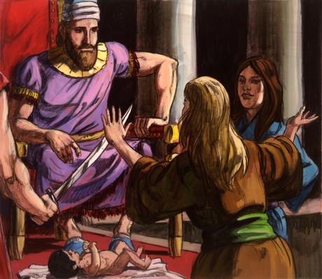
Solomon Makes a Difficult Decision


One day, the wise King Solomon was approached by two women arguing over a baby. Each claimed the child was hers. Unable to judge, King Solomon thought up a plan - he offered to cut the baby in half, giving half to the one and half to the other.

The first women agreed with the King: "Let the baby be neither mine nor hers, but divide it. If I can't have the child", she cried, "she can't have it either".

The second women pleaded with Solomon not to hurt the child.
"Give her the baby. I'd rather lose the child that see it slain".

Solomon knew immediately that this was the rightful mother. He returned the baby to her.

As we can see God gave Solomon enough wisdom to deal with this tough decision. The bible has lots of advice and it can help you anytime. Be wise, read it and don't let religion confuse you but love God and respect him. He loves you that is why he gave us his commandments.

This happened before:


Resultado de imagen para king solomon baby story bible
That night God appeared to Solomon and said to him, “Ask for whatever you want me to give you.”
Solomon answered God, “You have shown great kindness to David my father and have made me king in his place. Now, Lord God, let your promise to my father David be confirmed, for you have made me king over a people who are as numerous as the dust of the earth. 10 Give me wisdom and knowledge, that I may lead this people, for who is able to govern this great people of yours?”
11 God said to Solomon, “Since this is your heart’s desire and you have not asked for wealth, possessions or honor, nor for the death of your enemies, and since you have not asked for a long life but for wisdom and knowledge to govern my people over whom I have made you king,12 therefore wisdom and knowledge will be given you. And I will also give you wealth, possessions and honor, such as no king who was before you ever had and none after you will have.” It is in 

2 Chronicles in the Bible. Now I'd like you take some time to answer this question:

Resultado de imagen para solomon asked for wisdom

The wise man at River Ganges


A wise man who was visiting River Ganges to take a bath found a group of family members on the banks, shouting in anger at each other. He turned to his disciples smiled and asked. ‘Why do people shout in anger at each other?’

Disciples thought for a while, one of them said, ‘Because we lose our calm, we shout.’ ‘But, why should you shout when the other person is just next to you? You can as well tell him what you have to say in a soft manner.’ asked the man.

Disciples gave some other answers but none satisfied the other disciples.

Finally he explained, "When two people are angry at each other, their hearts distance a lot. To cover that distance, they must shout to be able to hear each other."

"The angrier they are, the stronger they will have to shout to hear each other to cover that great distance."

"What happens when two people fall in love? They don’t shout at each other but talk softly, because their hearts are very close. The distance between them is either non-existent or very small…" The wise man continued, ‘When they love each other even more, what happens? They do not speak, only whisper ‘n they get even closer to each other in their love."

Finally they even need not whisper, they only look at each other and that’s all. That is how close two people are when they love each other.’

He looked at his disciples ‘and said. ‘So when you argue do not let your hearts get distant, Do not say words that distance each other more, Or else there will come a day when the distance is so great that you will not find the path to return.’


The boy and the hammer

 Do you know someone who has a bad temper? Perhaps you have a bad temper that you wish you didn't have. Can you imagine the damage such a temper can do to you and others? 

There once was a little boy who had a very bad temper. One day, bothered by his fits of temper, his father decided to hand him a bag of nails and said that every time the boy lost his temper, he had to hammer a nail into the back fence.
On the first day, the boy had driven 37 nails into that fence.
The boy gradually began to control his temper over the next few weeks, and the number of nails he was hammering into the fence slowly dwindled down. He discovered it was easier to control his temper than to hammer those nails into the fence.
Finally, the day came when the boy didn’t lose his temper at all. He proudly told his father the news and his accomplishment so the father suggested that the boy should now pull out a nail every day he kept his temper under control.
The days passed and the young boy was finally able to tell his father that all the nails were gone. The father took his son by the hand and led him to the fence.

“You have done well, my son, but look at the holes in the fence. The fence will never be the same. When you say things in anger, they leave a scar just like this one. You can put a knife in a man and draw it out. It won’t matter how many times you say I’m sorry, the wound is still there. Son, a verbal wound is as bad as a physica
l one or maybe worse


kid showing bad temper with a hammer in hand

Moral of the story: 
Wasn’t that a beautiful story with a valuable lesson? Isn’t it a reminder most us need from time to time?
Everyone gets angry sometime or the other and some of us even have a bad temper, and that’s alright. But remember, once the scars are formed, they take a long time to heal.
Control your anger, and don’t say things to people in the heat of the moment, that you may later regret. Some things in life, you are unable to take back.